
Friday, 25 October 2013
Submission Disk Artwork

The artwork used for my disk.
I used the concept for scene 1 as this looked best on the template itself.
I used the concept for scene 1 as this looked best on the template itself.
One Point, Two Point and Three point Perspective Practice.

A basic exercise for each point perspective.
Thursday, 24 October 2013

Final Design: Scene 2

Scene 2: From the chapter "The Submarine Forest".
Included are the last thumbnails for Scene 2, including colour/settings tests.


Alien (1979) - Film Review

Fig. 1 - Official Film Poster
Alien (1979) is a science-fiction horror film directed by Ridley Scott. The film depicts a small crew aboard a ship travelling through space to get back to earth, all seems well until they land on an unknown planet only to bring back an alien species that begins to kill off the crew one by one. The film spawned 3 sequels and has been highly successful. Part of this success is due to the shocking scenes included and the use of suspense throughout, as said by Derek Malcolm, "No film I have seen in the last year or so, excluding perhaps The Deer Hunter, emanates so strong a whiff of palpable, nerve-straining shock." (Malcolm, 2009)
As previously mentioned, Alien uses the elements of surprise to really pull the watchers into it's world. The film centers heavily around the idea of suspense and the unknown in regards to the alien itself, it is rare to see a full shot of the life form for the majority of the feature, a choice that Scott made to allow the audience to imagine it as horribly, or not, as they wanted to. This idea of never being sure of it's real form instills a real fear and uncertainty in the viewer.

Fig. 2 - The Alien
In regards to both the alien and the set design there have been countless opinions and thoughts on the idea that the entire film production alludes to both the fear of sex and in some cases, rape. The alien sets and the creature itself were designed by H. R. Giger and Veronica Cartwright - part of the cast - spoke of his designs in regards to the idea of sex, "so erotic...it's big vaginas and penises...the whole thing is like you're going inside of some sort of womb or whatever...it's sort of visceral." (Cartwright, 2003)
The film is said to portray a fear of sex due to the actions and attacks of the Alien towards the crew and the way the crew themselves act towards each other, for example, when Ash attacks Ripley. He firstly pushes her down before rolling a magazine, attempting to force it down her throat to choke her, coupled with the designs and further imagery the opinions about this are fairly well supported and agreed upon by many.
Giger's designs are highly praised and revered for their portrayal of an extraterrestrial landscape, all of the sets used during the scenes on the alien planet are full of eerie structures and organic looking materials that contrast starkly to the man-made, practical and mechanical design of the Nostromos. Brian Eggert speaks of Giger's designs paired with Scott's directing, stating, "As we writhe about in fear from Giger’s suggestive designs, the film infiltrates its audience deeper than most could ever hope to achieve, doing so with fewer characters and deliberate pacing." (Eggert, 2012)

Fig. 3 - The crew gathered around one of the Alien sets which they had nicknamed the 'Space Jockey'.
Another surprising part of Alien is it's lead, Ripley. Portrayed by Sigourney Weaver, Ripley is everything most heroines were not. She is strong, appears intelligent and rather than to scream and run her first instinct is to find out how to kill the alien, at first not even willing to allow the smaller version of the creature on to the ship. Although many believe the scene where she undresses, unaware of the Alien still aboard her escape vessel, negate all of what the character had built up during the film. It can be argued that the scene played out this way to suggest vulnerability, possibly still suggestive of the psycho-sexual nature of other aspects of the film.

Fig. 4 - The Nostromos
Much like it's predecessors, Alien (1979) utilised miniatures in it's production. Most notably with one of the opening scenes, the Nostromos flying through space in a shot that much resembles the iconic scene from George Lucas' Star Wars (1977). The use of miniatures to produce sets can also be compared to other, much older, films we've watched such as Metropolis.


Fig. 5 - (Above) Star wars (1977)
Fig. 6 - (Below) Alien (1979)
Fig. 6 - (Below) Alien (1979)
Overall, Alien is a classic horror film, with the use of suspense to keep the watcher on their toes and the designs of it's sets and creatures perfected to give an uncomfortable feeling that will unsettle most. It as Brian Eggert said,
"Made with uncommonly crafted skill to unsettle the minds and bodies of its audiences, Alien is a profoundly influential work and a lasting classic. The risks taken by this film make it a rarity, while its methods yield a paradigmatic specimen whose combination of genre thrills, bound by great artistry and innovation, have yet to be bested by imitators." (Eggert, 2012)
Bibliography:
Quotes used:
Malcolm, Derek | 2009 | The Guardian | Derek Malcom's Alien Review From 1979
At: http://www.theguardian.com/film/2009/oct/13/derek-malcolm-alien-review
Accessed on 24/10/2013
At: http://www.theguardian.com/film/2009/oct/13/derek-malcolm-alien-review
Accessed on 24/10/2013
Eggert, Brian | 2012 | Alien (1979)
At: http://www.deepfocusreview.com/reviews/alien.asp
Accessed on 24/10/2013
At: http://www.deepfocusreview.com/reviews/alien.asp
Accessed on 24/10/2013
Cartwright, Veronica | 2003 | The Beast Within: The Making of Alien
Accessed on 24/10/2013
Images used:
Figure 1 | Alien (1979) [Poster] at http://www.blankmaninc.com/wp-content/uploads/2013/10/alien-movie-poster-1979.jpg
Figure 2 | The Alien [Still image] at http://www.sabotagetimes.com/wp-content/uploads/alien_from_the_movie.png
Figure 3 | The 'Space Jockey' set [Still Image] at http://extendededition.files.wordpress.com/2012/05/tumblr_m1df18gvqi1r8oqq3o1_1280.jpg
Figure 4 | The Nostromos [Still Image] at http://images3.wikia.nocookie.net/__cb20111224171811/alienfilmspedia/images/4/48/USCSS_Nostromo_002.jpg
Figure 5 | Star Wars (1977) [Still Image] at https://blogger.googleusercontent.com/img/b/R29vZ2xl/AVvXsEgrNyKzxc2P81NKf4ZT5-mL79Dt_sGo_h6xL8nFVUgYRNj_j03sFXknTxdEQ_tAVLO0J_R2EcqoxbAQg1IcunCtYaoDhbEWxn2xyZvpbGZgPde7-5sW61B3g8Bw5E3STbI7xOSkIytqZQin/s1600/A-New-Hope-Opening-Scene-Star-Destroyer-and-Tantive-IV.jpg
Figure 6 | The Nostromos [Still Image] at http://www.zen171398.zen.co.uk/Alien/0004Jon%20Sorensen's%20Half%20Size%20Nostromo%20Model%20for%20ALIEN%20FX%201978%20HQ.%20www.jonsorensen.co.uk.jpg
Wednesday, 23 October 2013
Scene 1: Colour and Lighting Thumbnail Tests

After deciding on this setting for my first scene, I've moved on from my first colour test to these thumbnails, using the same image but manipulating it in different ways.
Thumbnails 36 - 39, using the unfinished test from before, were adjustments in the saturation and exposure, I think I'm most pleased with the first attempt, 36.
40 - 47 were light tests, introducing the idea of a wall of glass. I'm not liking thumbnails 40 to 43, mainly because of the colour itself, a softer blue/green like 46/47 seems to have a better effect on the overall scene. 44 and 45 look good but seem to lose the idea of being underwater.
The last row, 48 - 51 is tests where both walls are lined with books, I noticed right away that the scene becomes a lot more closed in, almost claustrophobic, without the large light source of the window and I'm not sure if that's something I want for my piece.
Scene 1: Thumbnails and Colour Test


I tried out different perspectives, angles and looks for the library scene in these three thumbnails, I liked 35 the best and ended up creating a rough colour test.

I'm generally happy with this colour palette, although I'd like to enhance the lightning and in turn the shadows and also I'd like the tones to be a little richer to really give an almost expensive feel to the room.
The left side is unfinished on this test as I was still deciding whether to change the layout from both sides being full of books to one side being a wall of windows. The windows would allow me to still incorporate the outside environment in which the Nautilus is primarily situated. With the final design I plan to add in more pieces of furniture or decoration to represent Nemo's large collections and to give a more interesting perspective to the scene. I have more thumbnails ready to upload that I tested these thoughts on.
Wednesday, 9 October 2013
Metropolis (1927) Film Review
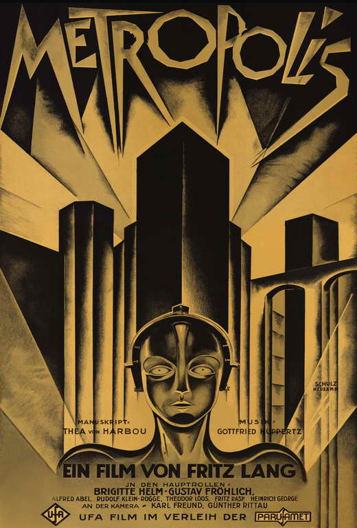
(Figure 1: "Metropolis" film poster.)
Metropolis (1927), directed by Fritz Lang, is a silent, black and white film depicting an almost Utopian society that is powered and kept alive by it's counterparts, the working citizens who reside underneath the city, working dangerously long hours to make sure Metropolis remains plugged in to all of it's electrical luxuries, the tension between both parties soon increases and a rebellion is imminent.
Lang depicted the workers as being almost identical in fashion and movements, scenes featuring the working class citizens tend to be wide and centered with each part expertly regimented, for example one of the first scenes shows the workers heading to and from their shifts, they move with synchronised marching, their heads hanging low and they do not change until they reach their stations. This expression of suppressed workers pushed aside by the upper class can be translated back to the events that were happening in Germany during the era in which the film was made.
Despite the whole film being in black and white, which nowadays we often use to portray something old or something rather melancholy, the scenes in which the upper areas of Metropolis feature are full of grandeur. The sets depict towering skyscrapers and wide motorways full to the brim with cars and other vehicles and despite this industrial like setting the city seems full of light with minimal smoke or pollution present, cementing it as the opposite of the lower class work place and residency, which is depicted as dull, heavily shaded and smokey (Shown below in Figure 2).

(Figure 2: A still from the film, depicting the workers at their stations.)

While watching Metropolis one cannot help to think about how ahead of it's time it seems, with seemingly huge sets and scenes brimming with people, even certain ideas and designs are almost modern in comparison with the other films of it's time, in a review by Jonathan Romney he states, "The film's futurism is still breathtaking, from its Art Deco titles to the neon spiral in Rotwang's lab: this surely must the first film to imagine people communicating by video screen." (Jonathan Romney, 2010.) Proving how looking back at Lang's film helps us to discover how much it has influenced the film industry of today.
Another key feature to mention is the camera work, compared to the film we watched previously, The Cabinet of Dr. Caligari (1920), the camera seems to move much more freely and on many occasions adds new perspective or movement to an otherwise still shot. As said by Roger Ebert in his review of Lang's film "The result was astonishing for its time. Without all of the digital tricks of today, “Metropolis” fills the imagination." (Roger Ebert, 1998).
In conclusion, during it's original time of release Metropolis (1927) offered a modern cinematic experience with innovative behind the scenes work in the form of set design and camera action, with some scenes being almost prophetic about what was to follow in the world of film after it's release. While there are charming points for both, the use of real but miniature sets offers a welcome alternative to the often overused special effects in today's cinema. Even after so many years, Lang's characters, designs and work methods from Metropolis continue to influence directors, set designers and more today, including the 2002 Japanese animated movie, also named Metropolis, which is based on the 1949 manga by Tezuka Osamu, which uses images straight from Lang's work.
Illustrations Used:
Figure 1: Metropolis (1927) Film Poster at http://images.moviepostershop.com/metropolis-movie-poster-1926-1020433586.jpgFigure 2: Metropolis (1927) Film still depicting workers at http://media.screened.com/uploads/0/985/300007-metropolis_productionstill_300dpi_09.jpg
Figure 3: Metropolis (1927) Depiction of the city at https://blogger.googleusercontent.com/img/b/R29vZ2xl/AVvXsEitj3R49ZVInf2VvQYm9NwnCXEaBye_lztxrDHtw-_Z0YfPftblUQlvyDDEKIGbbddv3JoDB-ff0lZMtpbvQFFYg-YnRwRJxlR1nfdSgmnbCspOkG2WkLMma5qX3wOLhplvV-uD-DaiDXA/s1600/Metropolis+1926.jpg
Bibliography:
Ebert, Robert1998
Metropolis
http://www.rogerebert.com/reviews/great-movie-metropolis-1927
Romney, Jonathan
2010
Metropolis, Fritz Lang
http://www.independent.co.uk/arts-entertainment/films/reviews/metropolis-fritz-lang-145-mins-pg-2076981.html
Tuesday, 8 October 2013
Thumbnails 17 - 32

The images represented in these thumbnails hold a lot more structure than the previous set, with clearer positioning and stronger lines. I also tried to play around with different lighting, perspectives and rounder shapes.
Monday, 7 October 2013
Influence Maps 2: The Nautilus and Artist Research

This is my second Influence Map for The Nautilus, this time I was interested in picking out a specific theme and design for the rooms and eventually after some research I decided to go for a Steampunk approach, finding that the aesthetics fit with both the period and feel of the story's setting. Hopefully these images will inspire a more interesting environment for my scenes from this chapter.

This next influence map is made up of images by other artists. I chose conceptual images from films, games and comics based around water as I needed some extra help getting to grips with how to create that kind of environment.
The images starting from the top left and moving clockwise are: A capture from the trailer for the game "BioShock", showing the underwater city of Rapture; An imagining of Captain Nemo's ship The Nautilus featured in the comic "The League of Extraordinary Gentlemen"; Concept art from Disney's "The Little Mermaid"; The same as previous and lastly concept art by Hayao Miyazaki for the Studio Ghibli film "Ponyo on the Cliff by the Sea".
Each image is unique with it's own style and portrayal of the ocean, I found the lighting in the Disney pieces and the image of Rapture to be incredibly helpful.
Thursday, 3 October 2013
First 2 Influence Maps and thumbnails 1 - 16.


To start, I have created two very basic influence maps, creating broad overviews of my visual inspirations for both chapters. The two chapters describe distinctly contrasting environments and while collecting pictures I tried to keep the colour schemes for each similar (i.e. sticking to blues and greens for the Submarine Forest and more earthy, red tones for The Nautilus.) I think this will help me later on when my sketches become more in-depth and I begin to really think about my colour choices for each scene, it will also help to keep me on track and constantly aware of the environments I'm working on. My next few maps will be much more detailed and varied.

I then returned to the thumbnails I started during our first photoshop tutorial and completed them. There are only a couple of scenes here that I'm really fond of and might take forward to expand on in later thumbnail collections. This is mainly because I was still testing out brushes and settings and so many of these don't reflect my ideas in the way I'd originally planned.
Subscribe to:
Posts (Atom)